


Breathing Life
Translating Fragrance into Form
Scent of Qui is more than a fragrance house, it is an exploration of identity, memory, and emotion through scent. When the brand approached Erahaus, it was with a clear ambition: to create a refined, story-driven luxury identity that would resonate across international markets. From the earliest conversations, it was evident that this brand was built not just on beautiful formulations, but on the philosophy that scent is a narrative medium, each bottle capturing a chapter in a larger story.
Our role was to translate that narrative into a cohesive, living brand. From foundational brand strategy to final visual execution, we worked hand-in-hand with the Scent of Qui team to define the core of their message: bold, minimal, and timeless. This was not just a branding project; it was the birth of a brand that had to speak in silence, feel luxurious without screaming, and leave a lasting impression as subtle as a lingering note of perfume.
")
")
")
Logo Design

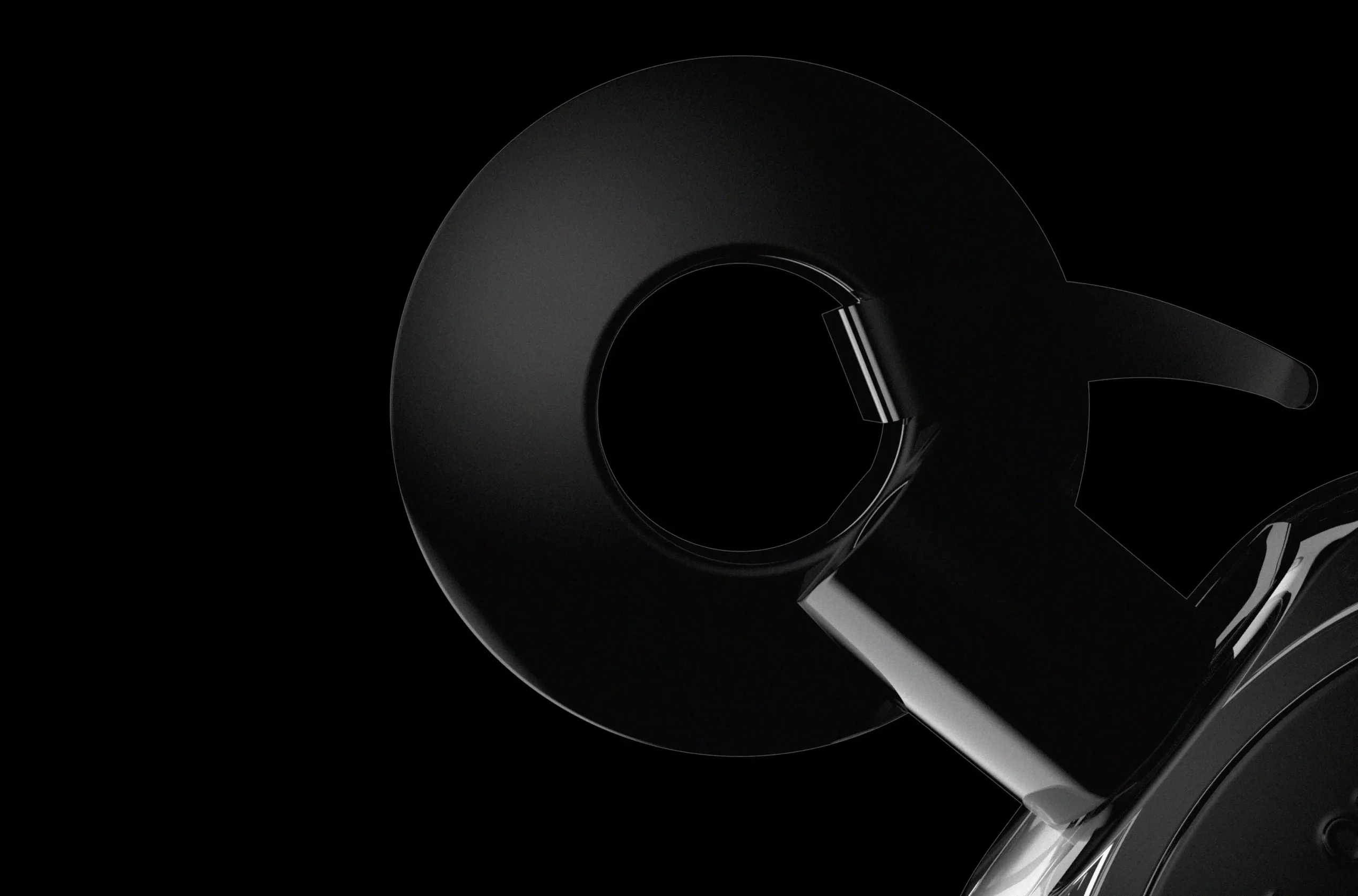
At the heart of the brand lies a logo that speaks volumes through restraint. We created a minimalist yet powerful Q, a letterform stripped down to its essential geometry, evoking the brand’s name while suggesting elegance, stillness, and intrigue. This wasn’t just about creating a recognizable mark; it was about designing a symbol that felt eternal. The simplicity of the logo is purposeful, allowing it to adapt across product packaging, digital presence, and environmental design without ever losing its power.
The logo’s circular form, delicately interrupted, represents the intangible nature of scent, a sensory experience that cannot be captured, only remembered. It feels modern yet rooted in classical design principles, offering balance, harmony, and space for interpretation. In the world of perfumery, where visual identity must enhance the invisible, this mark becomes a signature, quiet, intelligent, and unforgettable.

Visual Identity That Whispers in Elegance
We expanded the logo into a complete visual identity system designed to communicate premium craftsmanship while staying true to the brand’s poetic soul. The visual world of Scent of Qui is built on contrast, soft gradients against structured forms, monochrome palettes with accent metallics, and quiet typography that flows like scent itself.

Sculpting the Bottle
Design Meets Narrative
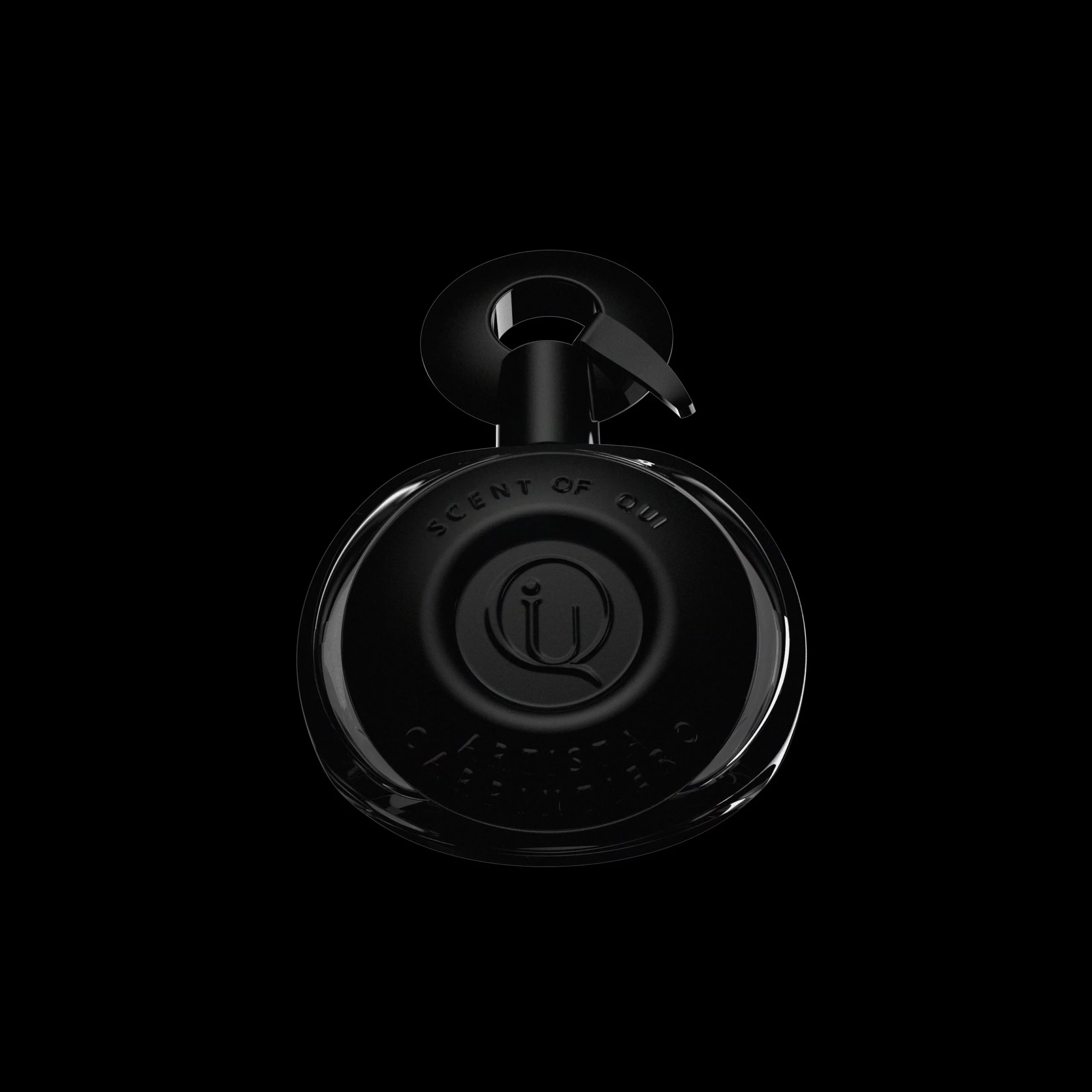
One of the most defining parts of our collaboration was designing the perfume bottle, the first tactile interaction between consumer and brand. We approached this as an object of art and memory, not simply a vessel for scent. The result is a sleek, curved black bottle with a smooth matte finish and subtle detailing. It sits comfortably in the hand like a sculptural object, designed to be admired and remembered long after the scent fades.
The curves mirror the flow of scent, while the absence of sharp angles reinforces the brand’s nonverbal, fluid identity. Every material was selected for texture, weight, and symbolic meaning. This is not just packaging, it’s a sensorial experience that begins the moment one lifts the cap. The bottle, paired with its minimalist packaging system, embodies restraint, confidence, and elegance.
The Exhibition Booth
Designing an Immersive Experience
To support Scent of Qui’s debut at Esxence 2025 Milan, we extended the brand's visual identity into a complete suite of print and display assets for their exhibition booth. From brochures and fragrance cards to large-format visuals and branded messaging, every piece was crafted to maintain the elegance and mystery of the brand in a live environment.Our goal was to ensure that every element in the booth, became an extension of the brand's refined identity. Print materials were produced using carefully selected papers and finishes to enhance tactile quality and reflect the understated luxury of Scent of Qui.
Typography, layout, and imagery were all aligned with the core brand system, creating a seamless visual language across digital and physical touchpoints.Through precise execution and thoughtful design, we transformed the booth into a cohesive, story-driven space, inviting visitors not only to discover the scents, but to experience the brand as a whole through refined visual storytelling.

You Can Check This Project on "World Brand Design Society"