


Our Vision
Creating Light Beyond Aesthetics
For FRENILUX, our vision was to craft an identity that not only highlighted their product excellence but also conveyed their core values: sustainability, innovation, and a commitment to enhancing lives through light.
Each step of the project was guided by our mission to bridge the gap between design, functionality, and the client’s ambitions.


Branding
Bringing FRENILUX to Life
Our goal was to establish FRENILUX as a premium, forward-thinking brand. We crafted a visual identity that captured their ethos of blending elegance, sustainability, and technology.
Color Palette: A sophisticated mix of dark and light tones, symbolizing professionalism, energy, and harmony. Typography: Clean, modern fonts that reflect clarity and precision. Branding Guidelines: A comprehensive guide ensuring consistency across all platforms and applications.
This refined color palette harmonizes bold contrasts with soft gradients, symbolizing professionalism, dynamism, and unity. Each tone is carefully chosen to convey trust, creativity, and an innovative spirit, reflecting the brand’s commitment to excellence and forward-thinking design.

The chosen typeface reflects innovation and precision, with sleek geometry and clean lines ensuring clarity across all platforms. Its subtle gradient seamlessly ties to the brand’s aurora-inspired concept.


Inspired by the Aurora
Drawing inspiration from the enchanting auroras, this design captures the essence of nature’s most captivating light display. The logo reflects the harmonious blend of fluidity, vibrance, and modernity, embodying both poetic beauty and forward-thinking innovation. Each element mirrors the grace of the aurora, creating a visual identity that inspires and resonates.

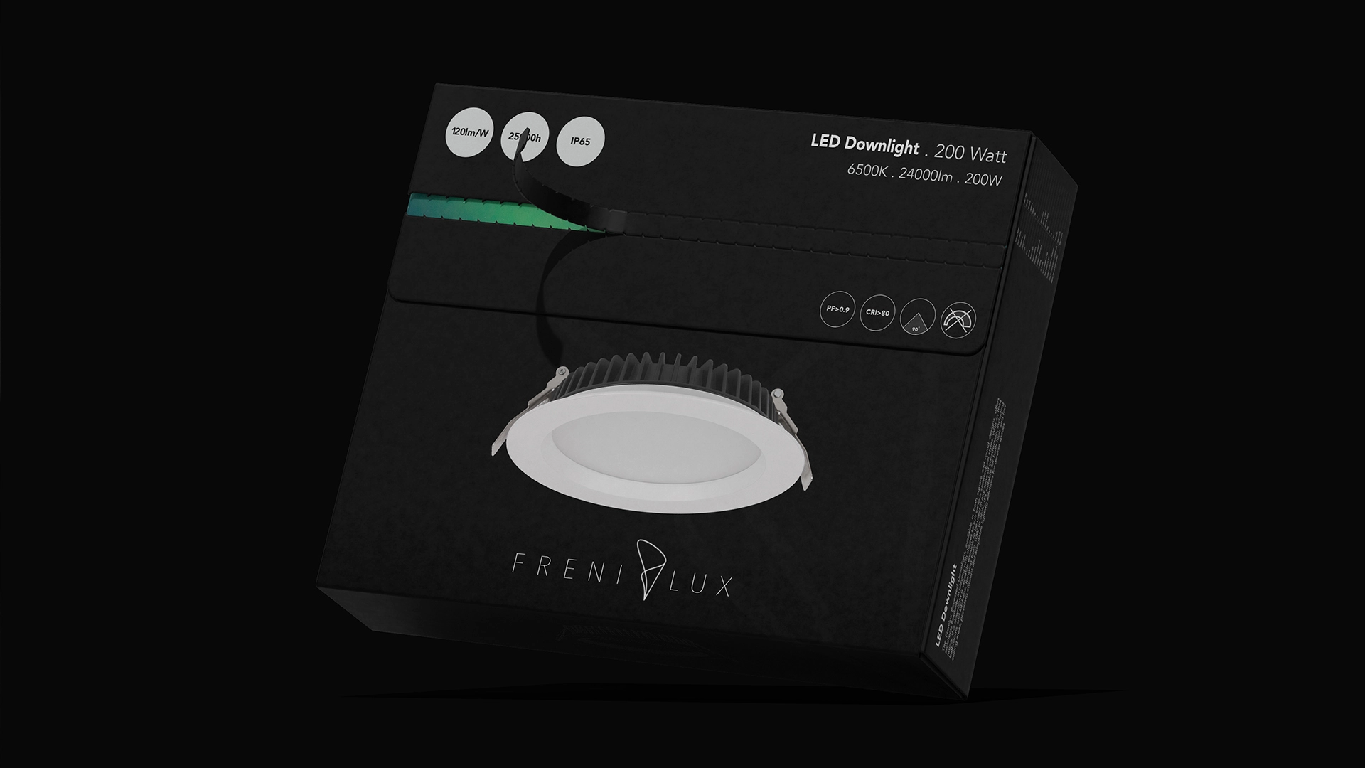
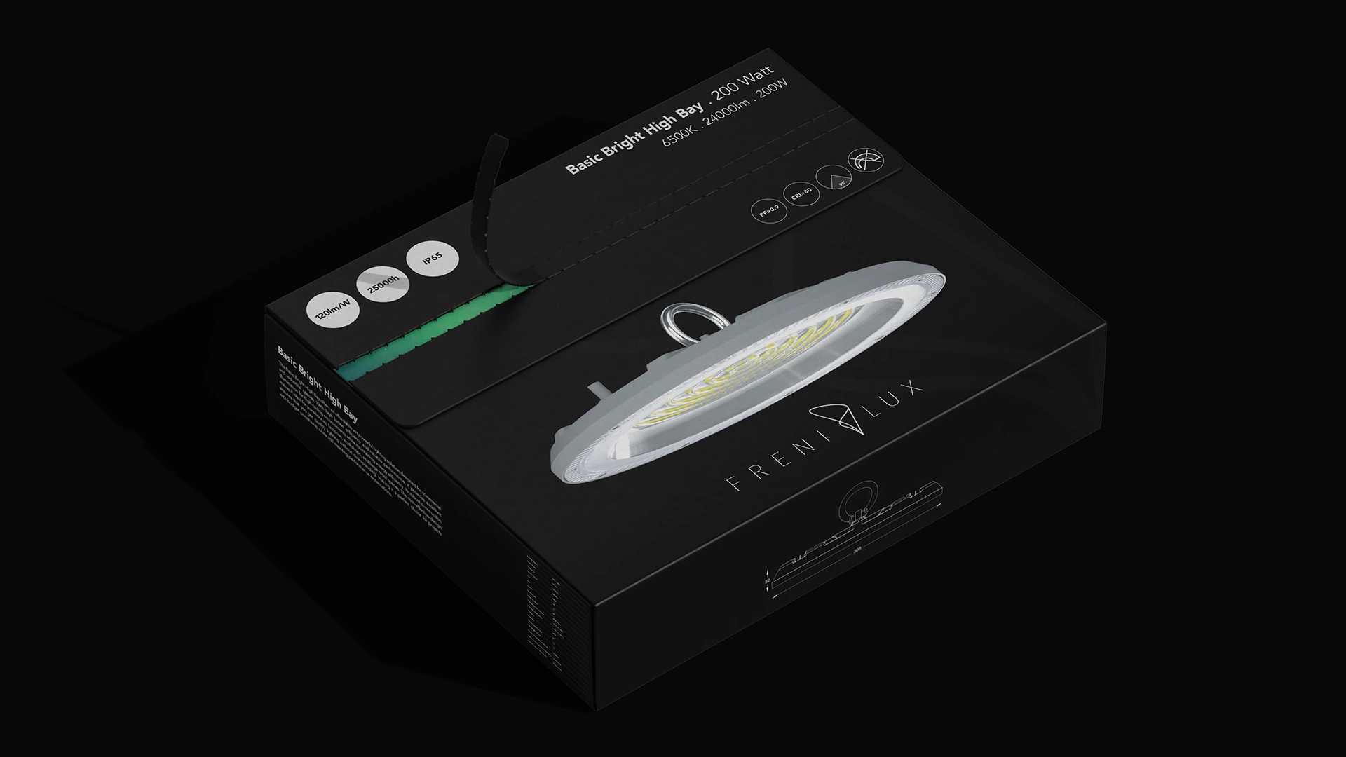
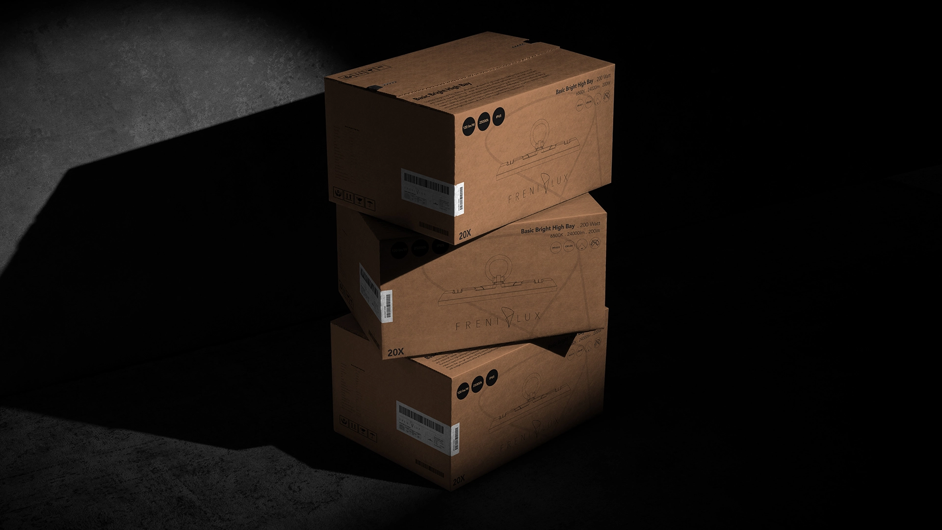
Designing Packaging with Purpose
Minimalistic
Contemporary
The packaging design for FRENILUX products goes beyond function, offering an immersive and memorable unboxing experience. While the sleek black exterior reflects the brand's commitment to modernity and professionalism, it’s the unexpected interior detail that truly sets it apart. Upon opening the box, customers are greeted with a vivid depiction of the aurora borealis, a breathtaking display of natural light that echoes the inspiration behind the FRENILUX logo and brand identity.
This thoughtful design element transforms a routine task into a moment of wonder, reinforcing FRENILUX’s commitment to blending innovation with artistry. The aurora imagery not only highlights the brand’s connection to light and sustainability but also creates an emotional connection with the user, leaving a lasting impression of elegance and attention to detail. This approach to packaging design aligns perfectly with FRENILUX’s mission of delivering products that illuminate lives while celebrating the beauty of light itself.

You Can Check This Project on "World Brand Design Society"